Overview
If you are new to Webflow and want to get started, here is the link:
🚀 Check out Webflow:
https://webflow.grsm.io/webtotheflow
You'll be learning about:
👉 Webflow Animations in General
👉 How to Animate on Scroll using Webflow
👉 How to Use Keyframes in Webflow
⏲️ Timestamps
00:00 - Overview
00:35 -Setup
01:02 - Webflow BG-Color Scroll Animation
05:40 - Apply it to full body
06:23 - Animate the Card's Text
09:20 - Scroll out Animation
Introduction
Hello, rising developers and creative web designers! I'm Marvin Aziz, a dedicated developer deeply rooted in the broad field of web development. Today, I'll introduce a technique that's caught my attention - changing the background color on a webpage as users scroll. This fascinating feature is made possible by Webflow's interaction triggers. The technique can provide your website with an immersive edge, effectively capturing the attention of your users.
Navigating the Intricacies of Webflow's Interface
Before we delve into the action, it's critical to grasp the fundamentals of Webflow's designer interface. Visualize a layout punctuated with several cards—each card harbors a headline, a brief narrative, and a call-to-action button. Crafted to float into the spotlight as users scroll, these cards inject a dynamic pulse into the website. For an added touch of pizzazz, these cards are juxtaposed against a gradient backdrop, with a picture positioned at the page's terminus to demonstrate the color shift effect.

Crafting Scroll Animation in Webflow
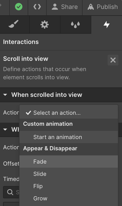
The core concept behind this scroll animation is to amplify user engagement by modifying the background color in response to user scroll. To realize this, I encase all the elements, right down to the final card, within a solitary section. Upon selecting the section, I traverse to the interactions tool—accessible by either pressing 'H' or by clicking on the interactions icon nestled in the upper right corner.
Next up, I create a new element trigger that springs into action 'while scrolling in view.' For the moment, I disregard the smaller screen sizes and proceed to craft a scroll animation. Webflow delineates animation boundaries to mark the animation's starting point and its cessation. However, these boundaries are left unaltered for the time being.
Animating the Background Color
Venturing into the next phase, I conceive a new animation, aptly termed "animate background color." I revisit the section, click on the plus sign, and then opt for the background color. Webflow deftly adds two keyframes. The maiden keyframe is pinned to a white backdrop, signifying the section's state before the scroll kicks in.
As users commence scrolling, I desire the background color to seamlessly transition to a darker hue. Upon scrolling past the final card, I desire the backdrop to reinstate its original white shade. This subtle color evolution weaves an enchanting and engaging narrative, with the background color adapting in response to user interplay.
Elevating the User Experience
The animation is calibrated to commence when 27% of the section becomes visible. I fine-tune this parameter to maintain the white backdrop for a tad longer before transitioning to 'dark mode'. This dark hue prevails until the final card, whereupon it reverts to white, ensuring a smooth color metamorphosis.
To elevate the user experience, I suggest applying the animation to the webpage's entirety, instead of just a particular section. This strategy dissolves any visible demarcations during the color shift, thereby fashioning a more immersive experience.
As a further layer of interactivity, I recommend altering the individual cards' background color in addition to the primary section. This tweak promises a more immersive and interactive user experience.
If you'd like to learn more and get some valuable nuggets for Webflow developers, consider signing up for my newsletter!
FAQs
- How can I smoothen my animations in Webflow?
Achieving smooth animations in Webflow hinges on tinkering with the easing settings. Easing manipulates how the animation speed fluctuates over time. You have the liberty to select from an array of ease presets or customize your own. - Can I implement scroll animations to all elements in Webflow?
Indeed, scroll animations can be incorporated into almost all elements in Webflow. Nonetheless, bear in mind that certain elements might exhibit unique behaviors or restrictions. - Why doesn't my scroll animation play in Webflow?
If your scroll animation hits a snag, ensure the animation trigger and the animation itself have been properly set up. Additionally, verify that the animation is associated with the correct element. If you'd rather hire me to solve it for you - let me know :) - How can I preview my animations in Webflow?
Animations in Webflow can be previewed by clicking on the preview button, located in the designer interface's top right corner. This allows you to engage with your project as a user would. Only custom code animations load only when published. - What are some alternative ways to employ interaction triggers in Webflow?
Beyond scroll animations, they can be used to devise hover effects, load animations, click interactions, and so much more.


%20(1).png)
.jpg)